Amazing website designs
Within this segment, I present a selection of webpages that have captivated my interest. These selected websites stand out due to their remarkable design aesthetics and exceptional functional attributes.
Vanier College: https://www.vaniercollege.qc.ca/
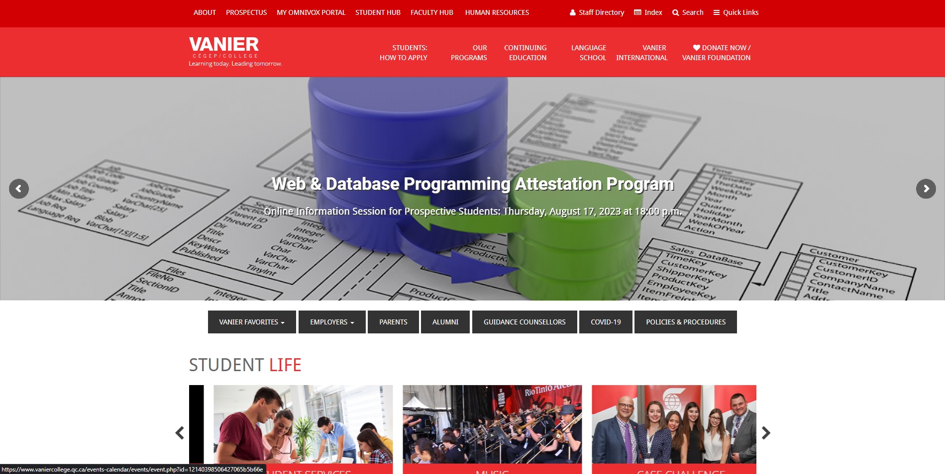
Vanier College's website stands out as a captivating digital platform owing to its meticulous design considerations. The layout seamlessly amalgamates red, white, and black colors, imparting a sense of sophistication and uniformity. This well-chosen color scheme not only exudes professionalism but also accentuates the site's visual appeal. Employing a structured grid display, the website showcases a skillful organization of content, enabling visitors to effortlessly explore diverse sections. The judicious positioning of these sections facilitates intuitive navigation, providing an enriching user experience.
Morgan Stanley at Work: https://www.morganstanley.com/atwork
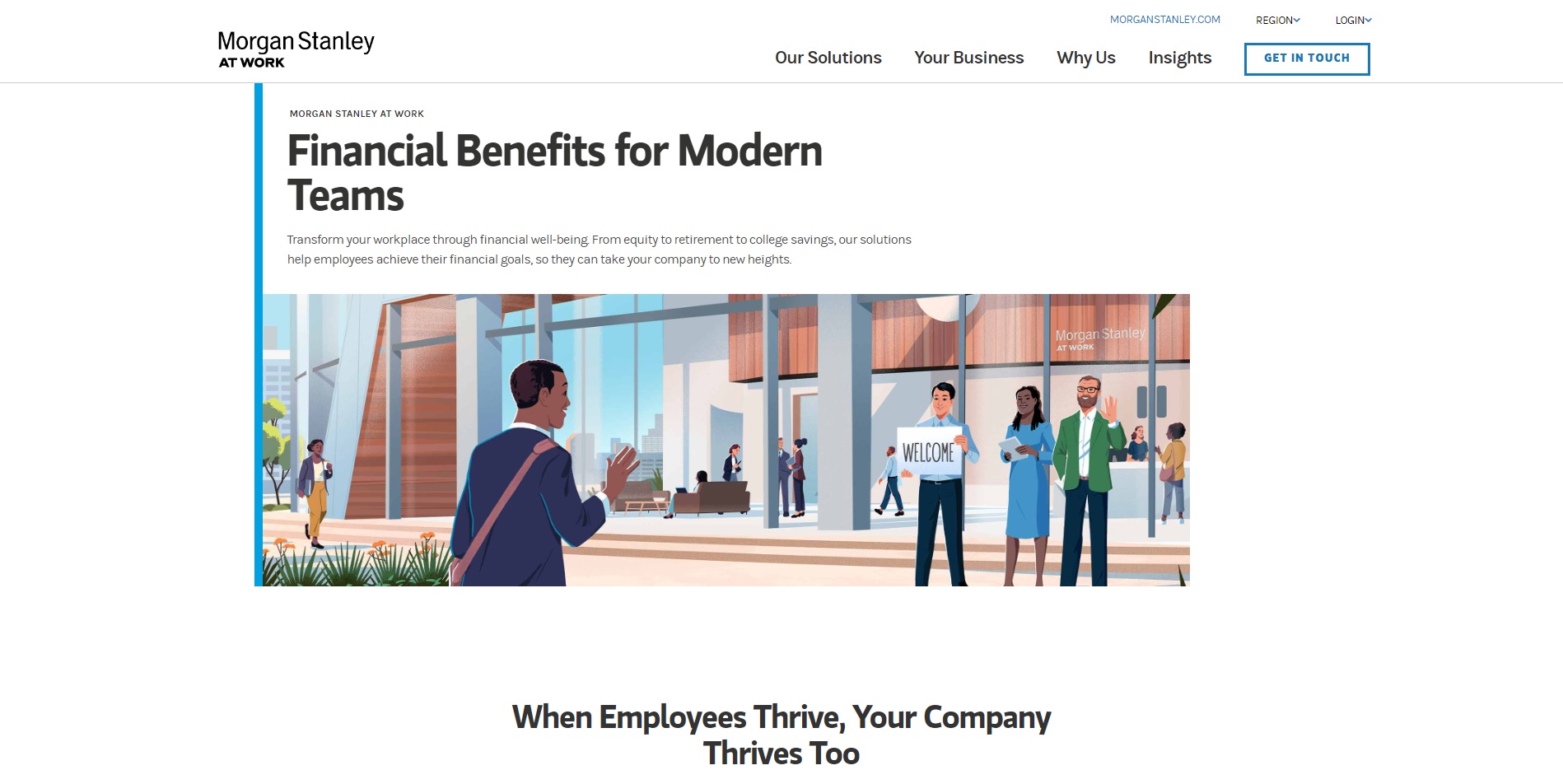
The Morgan Stanley at Work website is an exemplar of elegance and functionality. Its layout exudes a refined simplicity, enhanced by a harmonious blend of white and blue colors in a subtle low contrast. This selection of colors not only establishes a serene aesthetic but also signifies professionalism and trustworthiness. The layout's purposeful arrangement of sections reflects a user-centric approach, ensuring that essential information is conveniently accessible. Additionally, the incorporation of user-friendly infographics adds a layer of interactivity and comprehension, enabling visitors to grasp complex concepts with ease.
Not so amazing websites designs
In contrast to the previous segment, this section presents a selection of webpages that present an opportunity for further refinement to enhance their functional attributes..
ESPN: https://www.espn.com/
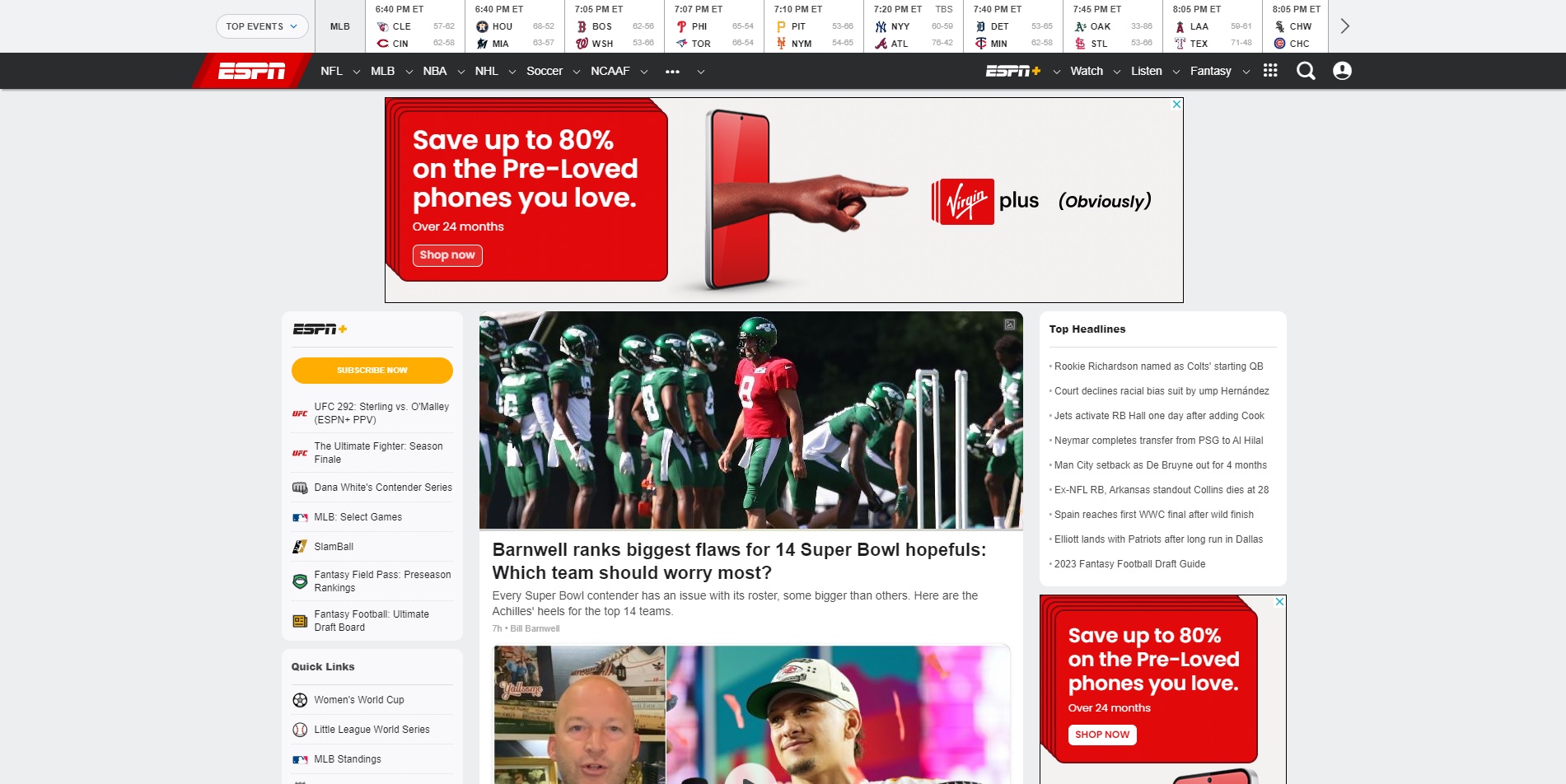
The ESPN website, however renowned, presents certain design challenges that hinder an optimal user experience. Its layout is characterized by an overwhelming influx of information, which can lead to cognitive overload for users seeking specific content. Furthermore, the lack of responsiveness across different devices diminishes the accessibility and usability of the site. Additionally, the extensive vertical scrolling necessitated by the webpage's length disrupts smooth navigation and may discourage users from exploring the entirety of the content. These aspects collectively contribute to an environment that, while rich in content, may fall short in delivering an intuitive and user-friendly encounter.
Goodreads: https://www.goodreads.com/
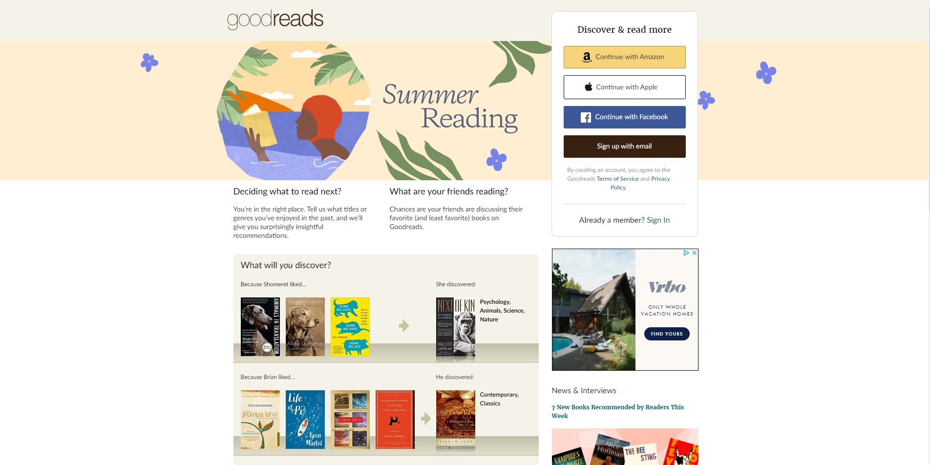
When examining the Goodreads website, it becomes evident that the design aesthetics and user experience could benefit from substantial improvement. The website's design appears exceedingly basic and lacks the visual appeal that modern web users have come to expect. This simplicity extends to the color palette, which doesn't contribute to an engaging or memorable visual experience. Furthermore, the navigation on the website is less than optimal, causing frustration when attempting to locate specific content or features. The lack of intuitive navigation pathways may lead users to abandon the site in favor of platforms with more user-friendly interfaces.